
Typography makes your content read by your readers. Believe me!
Improving typography is one of the most important things you need to do for your blog. It refers to all the visual changes you need to do for text to make it stand out and readable. Good typography gives pleasure to the readers of your blog.
I am personally a great typography lover. I love reading content that's beautifully presented with good fonts and colors. Recently, I've been immersed fully in researching about typography. In this post, I'm looking to put forward all the things you need to know about blog typography.
Blog Layout

Readers come to your blog to read content. Presenting content in a great way should be your first priority.
Any elements that distract the main reader from reading your content should be removed. For example - frequent pop-ups, advertisements, or social media pop-ups.
- Your sidebar may be too close to the main content of your page. This distracts the readers while reading your content. You should leave some white space between the main content container and the sidebar area. You can adjust the width of the sidebar or main content area with the help of CSS.
In most of the cases just decreasing the width of the sidebar works well. Tweak the CSS in style.css and make sure you preview the changes using inspect element or other means. CSS code may vary; I'm using Genesis Framework..sidebar-primary { width: 323px; } - There should be no eye-catching elements in the sidebar. Once readers put their eyes on the lines, they should not be made to change their vision.
You should maintain plenty of whitespace between your main content and other elements of the page.
Paragraphs
- Have you noticed that the paragraphs are varied in length in the good blogs? Mixing up short and long paragraphs is the great way to improve typography of the content. It tricks your readers to read your content completely.
- Don't write long paragraphs. Longest paragraph on your blog should contain 80 words. Try shortening your paragraphs. Strip them up to individual ideas. No one likes to read heaps of text.
- Alignment of the paragraphs should be left on your blog. Center alignment is only used when presenting a story, poem, etc. in some cases.
- There should be enough space between the paragraphs.
![Space between paragraphs]() This can be made possible by adding margin-bottom property to paragraph.
This can be made possible by adding margin-bottom property to paragraph.
p {
margin-bottom: 28px;
}
 This can be made possible by adding margin-bottom property to paragraph.
Lines
- By writing long lines, you make your readers miss reading a paragraph. A line should contain 50-70 characters.
![Number of characters]() Usually on my blog, I have around 58 characters per line. This thing totally depends on the font size and width of the content. Adjust these two, so as to maintain the mentioned range.
Usually on my blog, I have around 58 characters per line. This thing totally depends on the font size and width of the content. Adjust these two, so as to maintain the mentioned range.
The width of the entry content can be modified by, tweaking the CSS..entry { width: 670px; }
 Usually on my blog, I have around 58 characters per line. This thing totally depends on the font size and width of the content. Adjust these two, so as to maintain the mentioned range.
- The space between the lines should be more. This can be achieved by tweaking line-height property in CSS.
![Line height]() When you maintain a good gap between the two lines, readers find it easy to shift from line to line. It comforts their eyes. I suggest you keep a line height of 1.7.
When you maintain a good gap between the two lines, readers find it easy to shift from line to line. It comforts their eyes. I suggest you keep a line height of 1.7.
 When you maintain a good gap between the two lines, readers find it easy to shift from line to line. It comforts their eyes. I suggest you keep a line height of 1.7.
Title of the blog post
This is the thing that people see when they land on your page.
- The font size of the title should be larger than all the other header tags. On my blog my h1 or title font size is 36px.
- I advise you to keep the title of your post Sans-serif if the content of your post in Serif; and vice-versa. You can look up for the perfect font combinations for the title and the body here at Font Pair.
- The line height of the title should be lesser than that of the main content. I've maintained the line-height of 1.2.
- There should be enough margin between the title and the below content, whether it's a byline or the main content.
See the below code.
.entry-title {
 font-family: Lato, sans-serif;
 font-size: 36px;
 margin-bottom: 30px;
 line-height: 1.2;
}
Some of the times, you may tweak the CSS code of h1 tag.
Body font
- I absolutely love the Sans-serif font for the body. That too, especially the 'Lato' font is great for typography.
- I usually keep the font-size 20px. Again it all depends on the font family you are using. Font size of 16px - 20 px are quite common. I insist you stick within that range.
- The font weight should be low. It makes your text look thin and creates a contrast between heading and your main text.
- Coming to the color, many suggest to keep the font color of the body slightly lighter than true black. But I've kept it to true black, because I love it. I also have a bookmarklet that changes the color of the text to black and optimizes a page I am reading on the web for readability.
- The background color of the body should remain white.
Do not use more than two font families on your blog.
body {
 background-color: #fff;
 color: #000;
 font-family: Lato, sans-serif;
 font-size: 18px;
}
Heading font
- The font size should be less than that of the content. The headings that I'm talking about here are h2, h3, h4, h5, and h6. In my blog font sizes of headings are 32px, 26px, 22px, 20px, and 18px respectively.
- Font familes of these heading should be contrast to that of the main text, so as to stand out.
- Font color depends upon your taste and should match the color scheme of your theme. But most of them stick to black color.
- I also use higher font-weight, to make the headings appear bold.
h2 {
 font-size: 32px;
 color: #CC4A00;
 font-weight: 700;
}
You may also want to use margin-bottom, to keep a gap between the headings and the content.
Hyperlinks
The default standard of links on the web is blue and underlined. But most of the typography lovers change the color of the links and remove the underline.

In my blog, I kept the color of the links to light-blue, i.e. the contrast of the orange color scheme of my blog.
It creates a nice typography.
You may also see the light underline for the links.
Below is the CSS code for the links on my blog.
.entry-content a {
color: #3870A7;
border-bottom: 1px solid rgba( 204, 51, 0, 0.1 );
}
The above code refers to the links inside the content.
Font family and size of links should be same as that of rest of the body.
Use of bold and italics
You need to make proper use of bold and italics on your blog.
Just put bold to some of the important sentences and words in your blog.
If you want to put stress on a particular word that can be easily skipped or misinterpreted. Use italics.
Must read: Bold, Italics and Underlines: How to Use Them Effectively in Your Blog
Lists
If you use so much of bullet points in your content, you may want to maintain some little gap between the two paragraphs. The lists should be clearly distinguishable to let your readers scan them easily.
.entry-content ul > li {
 list-style-type: disc;
 margin-bottom: 18px;
}
You can do the same for numbered list.
.entry-content ol > li {
 list-style-type: decimal;
 margin-bottom: 18px;
}
Lead paragraph
Some of the blogs and majority of the news sites have the habit of writing lead paragraphs. They are typically above the main introduction part of the post.
 It just helps your readers lead through the rest of the article. I'm not currently practicing the strategy, but soon will.
You can consider writing in header tags like h3 or h3. You could also consider increasing the font size and putting bold while writing.
Color could also be changed to dark gray, so as to catch readers' eyes.
Image typography
When you are creating images for your blog that have text in it, consider mixing up script fonts with regular with other regular fonts.

You can also combine the same font with different weights.
There's an excellent article on image typography by Canva. Make sure you read it.
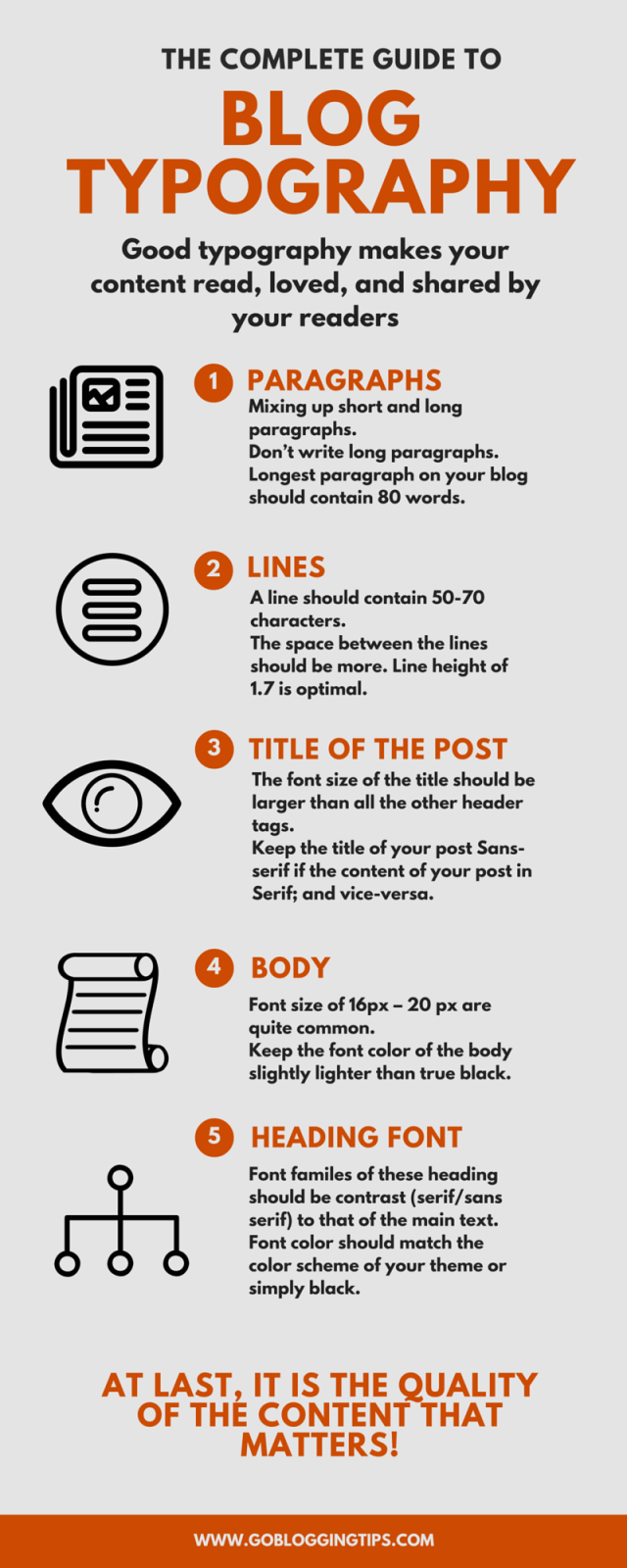
Below is the infographic of the post.
Use the below code to use the infographic on your blog.
Some words
I love typography so much that I've even changed the fonts and CSS on my WordPress post editor.
Learn how to do it here: How to Apply CSS and Change Fonts in WordPress Visual Editor
Maintain some standards for your blog. Ensure that the content is well presented. Of course. at last, it is the quality of the content that matters, than that of typography.
Do let me know any other tips or queries in comments. Please share the article.
The post The Complete Guide to Blog Typography appeared first on GoBloggingTips.